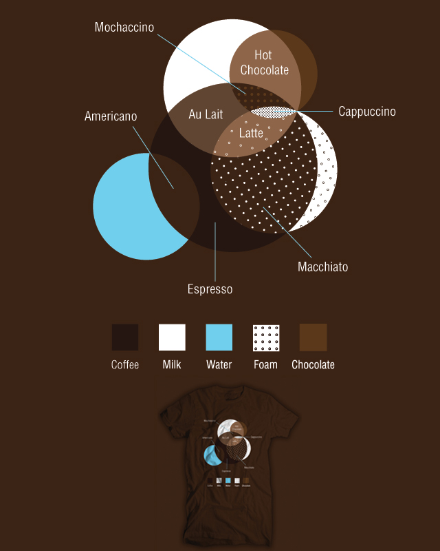
I was sent a link directly to this graphic that is a really nice piece of work. It shows how much of each ingredients goes into a variety of coffee drinks. The different coffee drinks are mentioned with an arrow to it’s ‘mix’ group. The overlapping circles show how much of what goes into a successful drink. It isn’t something you will actually base your pour on but it is a fun reference when you think of a drink for what it will be when handed to you.
At the bottom of the graphic is a t-shirt image and the link to the jpg is for a threadless.com subpage. But, I have searched the site using the number in the graphic’s URL and for espresso/coffee… nothing. If I find the actual items with the graphic printed on, I’ll post later. For now… enjoy.

